

Here is a typical construction sight...part way done with junk from other rooms piled up!
The dining room was originally the managers apartment. There is a little anteroom right before you come to that really gorgeous wood detailing. The pink is just a lighter colorway of the crime scene red in the lilbrary.
Sometimes I really like it becasue it is, after all, the perfect color pink to go with the library. But then there are days when I can;t stand it and it is all I can do to NOT fall to my knees sobbing. Lately, I'm liking it better each time I go in. Lucky for me, because really? Mike would redo it if I REALLY hated it. I think it must just be some weird hormonal thing.
On ocasion, I think it would be pretty if I striped it with just a satin glaze, but then that would mean ME getting the square out and doing all the taping and math and most likely having it be such a subtle change that not one person on the face of the earth would notice it. So then I would be faced with
A) realizing that you can over inflate in importance of very small details
B)having to smother all of my guests who don't noticed the very subtle striping
So the striping is just not worth it.


This detail will be replicated in the doorway leading into the library and if you notice, the wood work is really dark and red. THAT was in 2003. We had finished every pea pickin piece of woodwork, laquered it and it was just too dark and red. It was too thick looking and you lost all the detail.
Didn't like it so WE STRIPPED IT ALL. ( Ya think we're just a LITTLE OCD here?)
So here it is, all stripped again to the bare wood with the graining starting all over in the last photo.


The ceiling has been "picture framed" with running plaster molding and I'm looking for a 48 inch period chandelier to replace that flurescent tube. Did you know there is a formula to figure out how large your light fixture needs to be? Add the diminsions of two walls and that tells you how large the fixture will need to be...any smaller, it will look dinky and any larger, the light will over power your space. I've even thought about putting in two or three matching lights, but then i'd have to redo the medallion in the center of the ceiling.

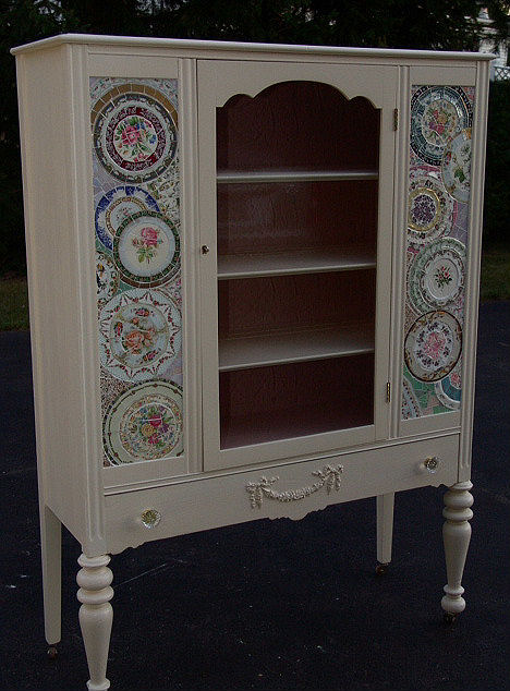
This china cabinet is too shabby chic for me, but I like the arched door and the graceful legs. I already have two china cabinets (one for the anteroom and one for the dining room) but the room is so large that we may end up building a hutch in. There is only one window in that room and I think we could put another on in and build a china cabinet in on the far end of the room. It certainly would balnace it out. Fuuny thing about Victorians; they build EVERYTHING asymmetrically. Oddly placed windows and awkwardly placed doors. Drives me crazy. I like things to be balanced and symmetical and matching. So there is always something that just makes me itch in this old building. Not that i don;t love it--I'm just saying that those Victorians needed to using a square and pair things up a little bit more.


3 comments:
It's a good thing you own this "hotel" you are remodeling. You have so many wonderful details either planned or refurbished that I don't think anyone could afford to buy it when finished! Thanks for your contined tour. Look forward to more.
Paulie
Agreed...this is a great tour. I envy you the man who has all the practical skills and talents that make a lot of this possible ;o)
I wish I had half your energy and eye for details. How is the shoulder?
It's 90% Mike, 9% being able to find real craftsmen and 1% ideas I stumble across in magazines. Sometimes the ideas need to be totally reworked, so there is just a breath of that idea left!
Post a Comment